The Tampa Bay Rays have always been willing to do things differently.
Though they routinely have one of the lowest payrolls in Major League Baseball, the Rays have reached the playoffs in five straight seasons by getting the most out of their roster.
They introduced the idea of an “opener” in 2018, leading to the best ERA in the American League just a month after the strategy, though that is just one part of a long list of Tampa Bay innovations.
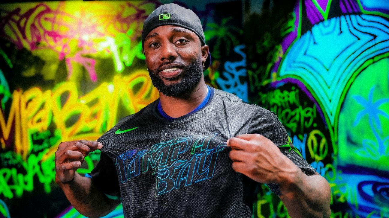
The Rays’ latest? The reveal of their City Connect uniform on Monday, which uses a balance of “grit and glow” and elements meant to highlight the unconventional nature of the organization.
Its on-field debut will come during the weekend series against the New York Mets beginning May 3 and will be worn every Saturday thereafter. The Rays will also be the first team to wear their City Connect uniforms on the road — they will wear the threads on June 16 against the Atlanta Braves and Aug. 7 against the St. Louis Cardinals.
The “grit” comes from the willingness to do things differently as an organization, while the “glow” is focused on the vibrance of Tampa Bay, according to Warren Hypes, vice president of creative and brand with the Rays. The design celebrates the city’s “counterculture scenes,” which include skate, street art, streetwear, tattoo and music, according to the Rays.
The jersey texture is meant to look like black that’s “been faded in the sun.” Tampa Bay is written across the chest, marking the first time the city’s name will appear on the Rays uniform since 2007. The letters themselves have a skateboard grip texture and a logo similar to Thrashers magazine, an influential skateboarding magazine founded in 1981. The cap logo is the combination of a ray and the Sunshine Skyway Bridge.
The Rays focused on different cultures and stories of Tampa Bay in their design. While Tampa Bay is perceived as a great place to retire or go on vacation, the Rays believed that it was important to touch on the “vibrant underground community” of the city.
A key element of that community? Skateboarding.
“Skateboarding makes you look at the world in a different way. If you talk to skaters and they’re trying to figure out how to skate stairs or rail or something else, something that’s not meant to be skated, you’ve really got to open your mind to a different way of thinking,” Hypes said. “And I think there’s so many natural ties and parallels to Tampa Bay, No. 1, and No. 2, the way we operate both on the business and team side here.”
In 1978, Tampa Bay opened a skate park at St. Perry Harvey Park, the first public one in Florida and one of the first in the country. Nicknamed the “Bro Bowl,” it is part of the National Register of Historic Places. There are multiple design features that pay homage to the city’s skateboarding heritage.
On the underside of the cap and jersey numbers lies a texture that resembles skateboard grip tape. An inside neck and pant hip graphic includes a Ray executing a “stalefish” skateboard trick where a skater grabs the back of the board, one of the more creative details of the uniform. According to Hypes, they wanted to illustrate the correlation between skateboarding and baseball with that element.
“Again, going back to the grit it takes to try a trick hundreds of times before you land it and looking at how that has parallels with baseball and all the hard work it takes. All the time in the cage, bullpen sessions, everything else it takes to have your big moment in baseball,” he said.
The jocktag graphic is a Pelican with three palm trees above it. The palm trees included in the Pelican decal is an ode to the historical marker located at the Bro Bowl. The Pelican refers to the roots and history of baseball in the area. The St. Petersburg Pelicans were part of the Florida State Negro League during the 1940s and 50s.
There are also references to the “Devil Rays” era of the organization throughout the design. The letters across the front of the uniform are a direct influence of the original Devil Ray lettering.
Gradient accents of the uniform is a subtle nod to the old Devil Ray throwback look. The gradient stripe is on the right sleeve of the jersey, but travels down the left side of the pants.
Hypes emphasized they wanted to reimagine the Devil Rays’ colors futuristically for the colors of the gradient accents. The decision to have the stripes designed to go from the right sleeve to the left pant ties back into the main organizational message of the Rays to be innovative.
“That’s just tying back into that against the grain attitude that makes this region special and makes us as a company special,” he said. “I think the way we operate our business, we very much carve an untraditional path in a game that’s so steep to tradition. And that’s our kind of nod to celebrate that.”
The designing process of the uniform with Nike began four years ago. There were six to eight different iterations of the uniform itself.
Hypes revealed that the first time they went to Nike, they had “several hundred different” ideas that ranged from big ones throughout the region and words that meant something to a location. However, Nike helped them narrow it to three or four different concepts.
Players such as Pete Fairbanks, who is into skateboarding and skate culture, have enjoyed the design. Star outfielder Randy Arozarena said they were “beautiful.”
“I think even people who maybe didn’t grow up with skateboarding as much in their culture have really connected to the color sets,” Hypes said. “And once you explain the story, we’re really invested in the way that we’re doing something different and telling a story differently with this.”
