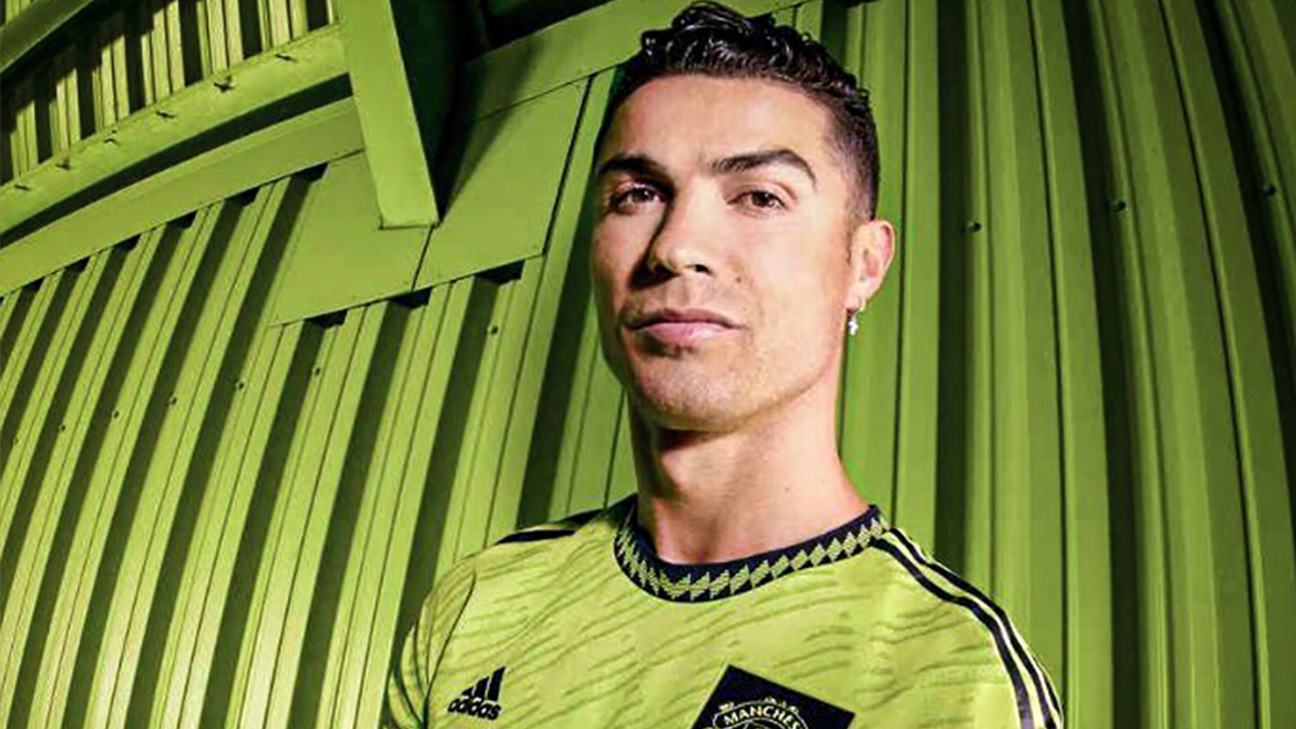
Manchester United have revealed their new third kit to the world but it’s unlikely to turn their rivals green with envy.
The jersey is supposedly directly inspired by the fashion culture of the 1990s, though there are also elements of Manchester United’s “graphic identity” which is represented in the all-over geometric print pattern.
Home.
Away.
Third ✅Introducing our new @adidasFootball 2022/23 third kit! 🟢#MUFC
— Manchester United (@ManUtd) August 12, 2022
If you hadn’t already noticed, it’s also the colour of a particularly toxic Amazonian tree frog. No wonder Cristiano Ronaldo couldn’t quite bring himself to smile after being roped into modelling the hideous thing.
🔋 Recharged with our new 2022/23 third kit 🟢#MUFC || @adidasFootball
— Manchester United (@ManUtd) August 12, 2022
The gunge green strip looks especially out of place once viewed alongside United’s new home and away kits for this season — both of which are excellent, retro-tinged designs that have proved immediately popular with supporters.
The excellent red home kit shirt is a tasteful amalgamation of several classic United strips of yesteryear, from the early 1990s right through to 2015. The white away shirt was also awash with subtle historic visual references plucked from several decades worth of United change kits.
Home:
An instant classic.
Now it’s time to take a closer look at our 🆕 home shirt 👇#MUFC || @adidasFootball pic.twitter.com/J1QQ5tUuQ7
— Manchester United (@ManUtd) July 8, 2022
Away:
🌃 Day or night, dressed in white.
⚪️ Presenting the new United 2022/23 away shirt.#MUFC || @adidasFootball
— Manchester United (@ManUtd) July 16, 2022
United’s ultra-garish green kit is just the latest example of a growing trend within contemporary football kit design circles to try and push the envelope when it comes to creating deliberately divisive third strips.
From the gaudy to the downright diabolical, more and more big clubs are finding themselves foisted with “unconventional” third kits that appear to be calculated ploys to get tongues wagging on social media, ergo drumming up a bit of extra buzz on launch day.
Thankfully, some clubs out there have successfully bucked that particularly trend and proved to their contemporaries that it is still possible to release a svelte, understated and desirable third kit in this day and age.
It’s a challenge to make rosy pink look good but Arsenal have used the heraldic “ermine” pattern found on their historic club crest as a jumping off point and cranked out a beautiful blushing third kit in pastel shades.
Our Arsenal 22/23 third kit has arrived! 🦩
Available now at Arsenal Direct, https://t.co/OblCU7YfdX and selected retailers 👇
— Arsenal (@Arsenal) July 29, 2022
Inspired by the colour of playing cards (yes, seriously!), Bayern’s new black strip is accented with contrasting monotone red trim. Exquisitely slinky, the Bavarians’ change kit is almost certain to shimmer moodily under the floodlights while providing an ace in pack on European nights.
Bayern-Herz ist Trumpf! ❤️
🗞️ Alles über unser neues #UCL Trikot: https://t.co/ih0vkOkFQy#MiaSanMia #FCBayern
— FC Bayern München (@FCBayern) August 11, 2022
That’s not to say that all third kits released for the 2022-23 are winners, with several notable clubs sticking to the format of going unnecessarily wild in their efforts.
Built different ✨ pic.twitter.com/n8BYLupDcN
— Tottenham Hotspur (@SpursOfficial) August 11, 2022
In fairness, Spurs’ new blue and navy ripple print design is an improvement on their truly, truly horrendous purple third kit from last season, but that really is the definition of damning it with faint praise. Hypnotic for all the wrong reasons.
The shirt is supposed to resemble the famous Mancunian worker bee, but that doesn’t explain why City also chose to throw an aggressively fluorescent shade of yellow and black “spray paint” effect stripes into the equation.
𝗠𝗔𝗡𝗖𝗛𝗘𝗦𝗧𝗘𝗥 💚🐝
Shop our 2022/23 third kit now ⤵️
— Manchester City (@ManCity) August 4, 2022
