The Philadelphia 76ers might boast the best top-to-bottom art in the NBA, so it made sense that they erred on the side of conservatism with their first-ever “city edition” alternate jerseys last season:
They played on the signing of the Declaration of Independence in Philadelphia in 1776 — the origin of the team’s name: a cream color to mimic aged parchment, and that gorgeous “Phila” script that echoes a signature and nods at the famous Wilt Chamberlain-era “PHILA” jerseys.
It was simple, and pleasing. But for Year 2, the team wanted to have fun. They just weren’t sure how when they started the planning process two-plus years ago. Nike, the league’s new jersey supplier, had an idea: three different jerseys, one per year starting in 2018-19, paying homage to various “Rocky” movies. Sylvester Stallone’s fictional boxer is a Philadelphia icon; the famous statue of Rocky, arms raised in triumph, still stands at the bottom of the steps leading to the Philadelphia Museum of Art.
The Sixers did not like the idea, says Chris Heck, the team’s president. “[Nike] almost lost me when they presented the idea of doing three,” he says. “Rocky running the streets of Philadelphia — that’s authentic. Once you get into Clubber Lang and some of other stuff, you lose the luster.”
Nike had been toying with the idea of a new uniform in the shade of heather gray, says Wil Green, design director for Nike basketball. They considered heather uniforms for a few teams. When the Sixers objected to multiple “Rocky” looks, both sides wondered if they might find common ground on a singular “Rocky”-inspired jersey that would reference the gray sweatsuit Stallone wore in the training montage from the original film — perhaps the most famous of all “Rocky” scenes. (Seriously: If you can watch that scene, with Bill Conti’s “Gonna Fly Now” surging in the background, without getting goosebumps, I’m not sure we can be friends.)
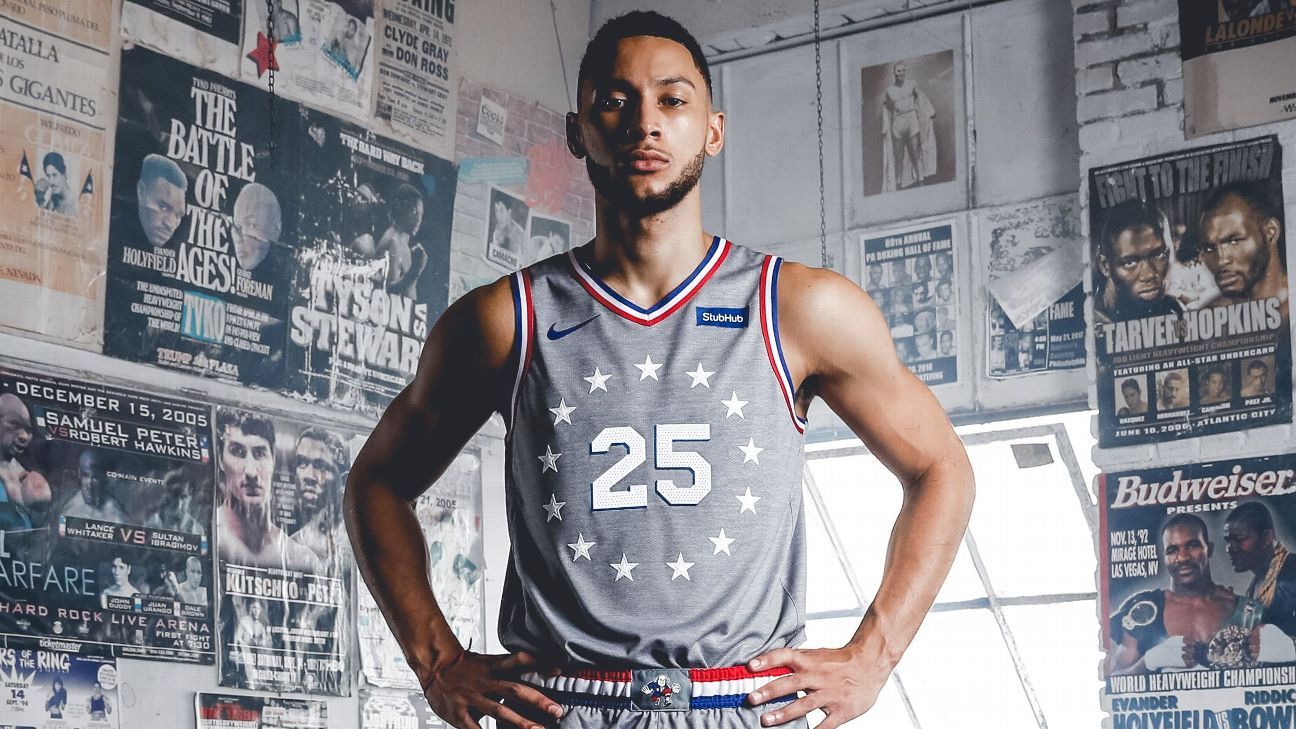
They landed here, with the Sixers’ official city edition look for this season, released exclusively to ESPN.com on Tuesday:
That jersey is a gamble. It could have ended up dull. Gray is dull. Even riskier, the Sixers and Nike chose a jersey front that includes no reference to the team’s name or home city, or any letters at all — one of only a few such jerseys in league history. (Chicago’s city edition for this season is also among that group.)
But the thing works. It gets better every time you look at it. Gray jerseys are rare enough in the NBA that this one stands out. The flourishes of color — red-white-and-blue striping, blue shadow behind the jersey numbers — bring almost double the usual flair because of how starkly they pop against that gray. The stripes work as a reference to both the Sixers’ history-based identity, and the patriotic boxing trunks Apollo Creed and then Rocky Balboa wore across several films.
Players like them. The team had a few players wear the jerseys, and re-enact scenes from the movies to include in promotional material. Ben Simmons posed in a local boxing gym. Robert Covington ran some of the route Rocky traced in training sequences — including the city’s famed Italian Market. Best of all: T.J. McConnell in a gray sweat suit, standing in a real-life, freezing-cold meat locker, hands wrapped in bloody tape.
McConnell volunteered for meat locker duty. “If we’re gonna do this, I want to go all out,” he recalls telling team officials. “I want to be in the meat locker.” The team would not let him punch the frozen slabs. “I was told they were so frozen solid, I might legitimately break my hand,” McConnell says.
0:40
The 76ers’ new alternate uniforms pay homage to “Rocky” and Philadelphia’s heart and determination.
As you’d expect, the journey to the final product included a bunch of detours and rabbit holes.
The team and Nike discussed a black-and-gold uniform that would lift the colors from the trunks Rocky wore in his first fight against Clubber Lang (portrayed by Mr. T) in “Rocky III.” The black-and-gold look is a source of some good-natured controversy within the Sixers’ creative team. The Sixers wore black away jerseys during much of the Allen Iverson era, including in 2000-01, when the team made the Finals; gold appeared on some of the trimmings.
There is powerful nostalgia for the Iverson era. “I grew up here and I’m obsessed with A.I.,” says Katie O’Reilly, the Sixers’ chief marketing officer. “It’s an ongoing conversation: What is the appropriate time to nod back at that era?” Desron Dorset, the Sixers’ vice president of business development, points out that 2020-21 will mark the 20th anniversary of that Finals run. Heck objects to black as a betrayal of the franchise’s core color scheme.
“I can’t believe we ever used black and gold,” he says, laughing. “It’s almost disrespectful to me. But fans do love it. It was a good time for them. They fell in love with Iverson. We are never going to say never, but I’m not rooting for it.” (Heck also points out that black and gold are the colors of the National Football League’s Pittsburgh Steelers. That is a hard sell in Philly.)
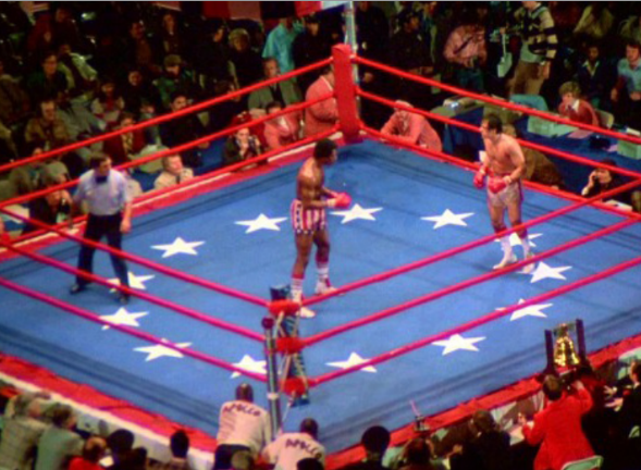
The circle of 13 stars (one for each of the original colonies) around the numbers enlivens the minimalist jersey fronts. Those stars represent a happy coincidence. They are part of the Sixers’ iconography — they rest atop the “7” in Philly’s current primary logo — and also appeared on the canvas of the ring in the climactic Creed-Balboa fight in “Rocky.”
“It all came together with the stars,” Heck says.
Another bit of happenstance: As the Sixers began plotting these jerseys, they realized MGM and Warner Bros. were shooting “Creed II,” starring Michael B. Jordan as Adonis Creed, Apollo’s son, in Philadelphia — and that the movie was likely to be released in the early part of the 2018-19 NBA season. The team even let Jordan and his friends work out in its new practice facility, a rare allowance for non-employees, Dorset says.
The dream was to have Jordan wear this jersey in the film, but that proved impossible, Dorset says. Jordan will promote the jersey on social media. The team hopes he will serve as their celebrity center-court bell-ringer on Nov. 9, when the team first wears the jerseys at home, team sources say.
The letter-less look was not necessarily Plan A. The cutting room floor contains versions with the “Phila” script; the full cursive “Philadelphia” wordmark that runs along the baseline of the team’s refashioned court; and even a wordmark rendered in the font from the original “Rocky” movie posters, according to Green and team staffers. (As an aside, some team higher-ups will fight the inclusion of “Philly” in any team art. “You will never see ‘Philly,'” Dorset says. “‘Philly’ is slang. ‘Phila’ is short for the city.”)
Designers even experimented with shading the art museum steps into the jersey front, but it proved too messy and complicated, Green and team officials say. “I wouldn’t rule that out over the next five years,” O’Reilly says.
Going letter-less was the right call. Alternate jerseys should be a place for adventure; each team has at least two, and they change every season. Duds don’t linger. Be daring. I do wonder if the stars and numbers will show up enough from a distance, or on television. They might fade into the gray. Would coloring the stars blue have helped?
With the jersey front settled, there was only one major area of debate left: the belt buckle. Dorset and others pushed for a full-on boxing championship belt, complete with giant gold buckle rendered in the middle. Nike created mock-ups. Team officials concluded it was a little much.
“There is a fine line between going out on a limb and just being goofy,” Heck says. “This is the franchise of Dr. J [Julius Erving], Chamberlain, and Charles Barkley — iconic guys. We don’t want to go too far off the grid.”
“Frankly,” O’Reilly says, “we didn’t want to be corny.”
Given the lack of team identifiers across the jersey chest, the Sixers and Nike concluded they needed something team-specific in that belt-buckle space. Enter “Ballin’ Ben,” the team’s alternate logo featuring an animated Ben Franklin in the midst of a mean, stiff-arm dribble move. This is the first time the Sixers have put Ben on a jersey, O’Reilly says. It helped that merchandise featuring Ben sells at a higher-than-normal rate, she says. (As an aside, business with the Sixers is generally good. They recently jumped into the No. 1 spot for most season seats sold, according to team sources.)
They tried reworking Ballin’ Ben so that he would stand in Rocky’s celebratory pose, arms over head, hands balled up in firsts. They decided to stick with the same Ben. They also plopped a “76” onto the bottom of the shorts, and a small blue “Philadelphia, USA” above the official NBA/Nike tag. Unfold the right vent at the bottom of the shorts, and you’ll find the famous Revolutionary-era “join or die” snake that adorned center court during playoff games last season — and will again this time around.
Dorset says the team will likely order some merchandise with the golden title belt design, but only for non-public distribution to employees.
Subtle is probably better. Adding gold to red, white, blue, and gray may have been one color too many.
The team is optimistic fans will like the jerseys. As of now, there are no plans for further “Rocky” jerseys.
“This is our ‘Rocky’ uniform,'” Heck says, “and this one is it.”


